Cavora
- Product design, iOS and web engineering
- Expo (React Native) · TypeScript · Supabase · RevenueCat · HealthKit
- iOS 16.4+, web
- 2026
Executive summary
Cavora is a patient-owned health record for iOS. Medications, vitals, lab results, appointments and the drawer of paperwork that comes with being a patient all live in one place — and when a doctor asks "so what's your history?", the answer is a QR code on the phone rather than ten minutes of remembering.
I designed and built the mobile client end to end: the information architecture, the design system it shares with the web app, the sharing model that is the product's actual thesis, and the onboarding that has to earn a stranger's medical history in about ninety seconds.
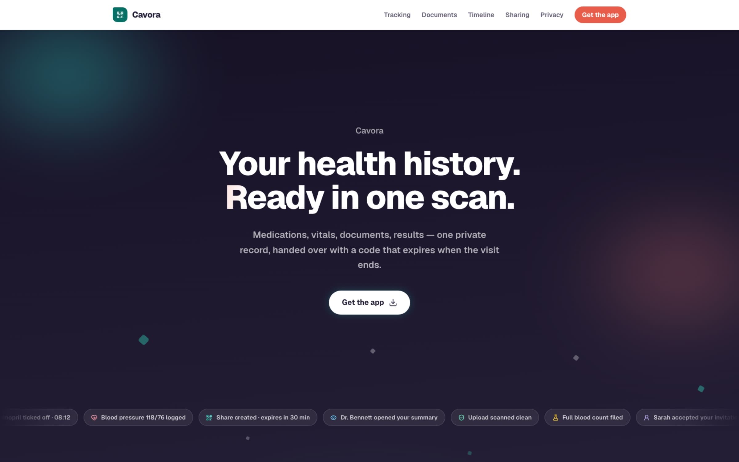
"Your health history. Ready in one scan."
— Cavora's hero line, and the whole product argument in six words
- 20
- independently toggleable share scopes
- 1 tap
- from opening the app to a live share code
- 0
- clinician-side installs required
- 2
- clients sharing one design language
Product context
Every patient is the only person who attends all of their own appointments — and is the worst-equipped participant in the room. Records sit in whichever hospital system created them. The patient carries the connective tissue in their memory, under time pressure, often while unwell, and often for somebody else: a parent, a child, a partner.
The existing answers fail in opposite directions. Hospital portals are accurate and siloed — one login per institution, none of them talking. Consumer health apps aggregate wearables beautifully and know nothing about the biopsy result that arrived as a PDF. And the actual default, still, is a folder of paper and a photo roll full of prescription pictures.
- People managing a long-term condition, who see several clinicians who do not share a records system between them.
- Carers — the adult child holding a parent's medication list, the parent holding a child's allergy history — which is why access is invitable and scoped rather than assumed.
- Anyone walking into a first appointment with a new doctor, where the entire consultation is bottlenecked on history-taking.
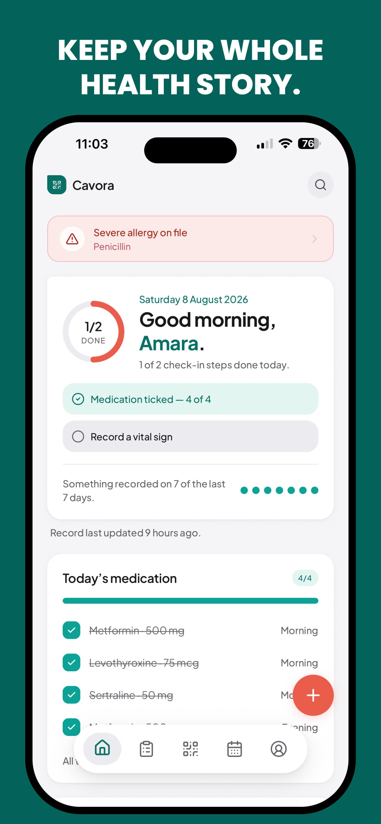
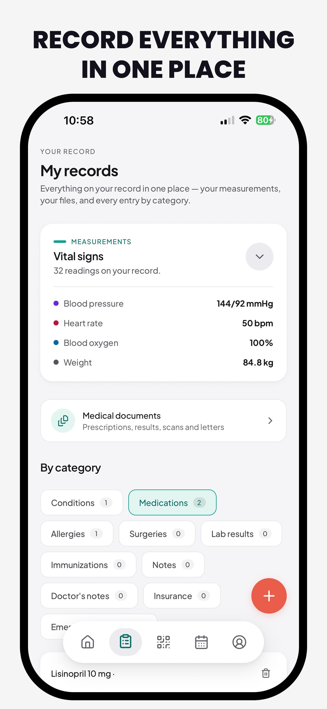
- One record, not one dashboard — vitals, medications, results, documents and appointments are one object with different views, not separate mini-apps stitched under a tab bar.
- Sharing is the feature — a record you cannot hand over is a diary. The share flow got the design attention a checkout flow gets in commerce.
- Disclosure is granular and reversible — the patient chooses what is included and how long it lives, and can revoke it while still in the room.
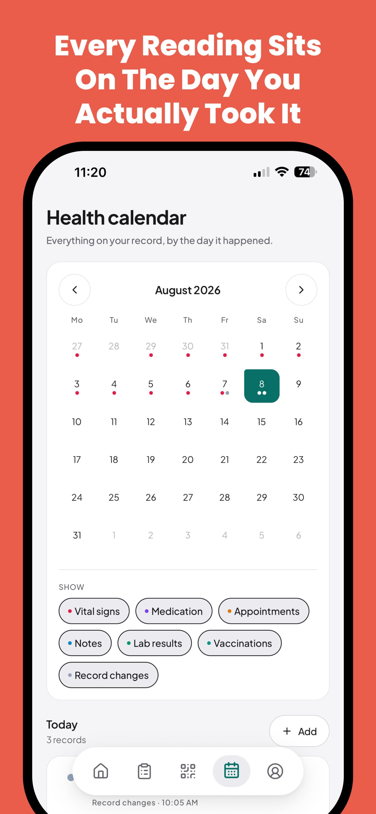
- Every reading sits on the day it happened — the calendar is the spine, because clinical questions are almost always temporal ones.
The sharing model
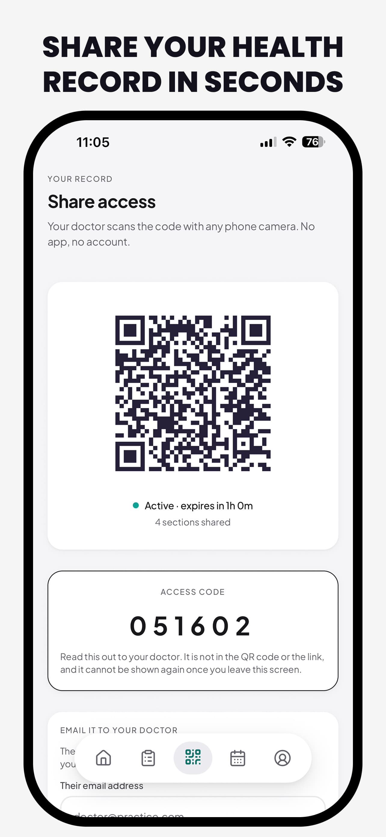
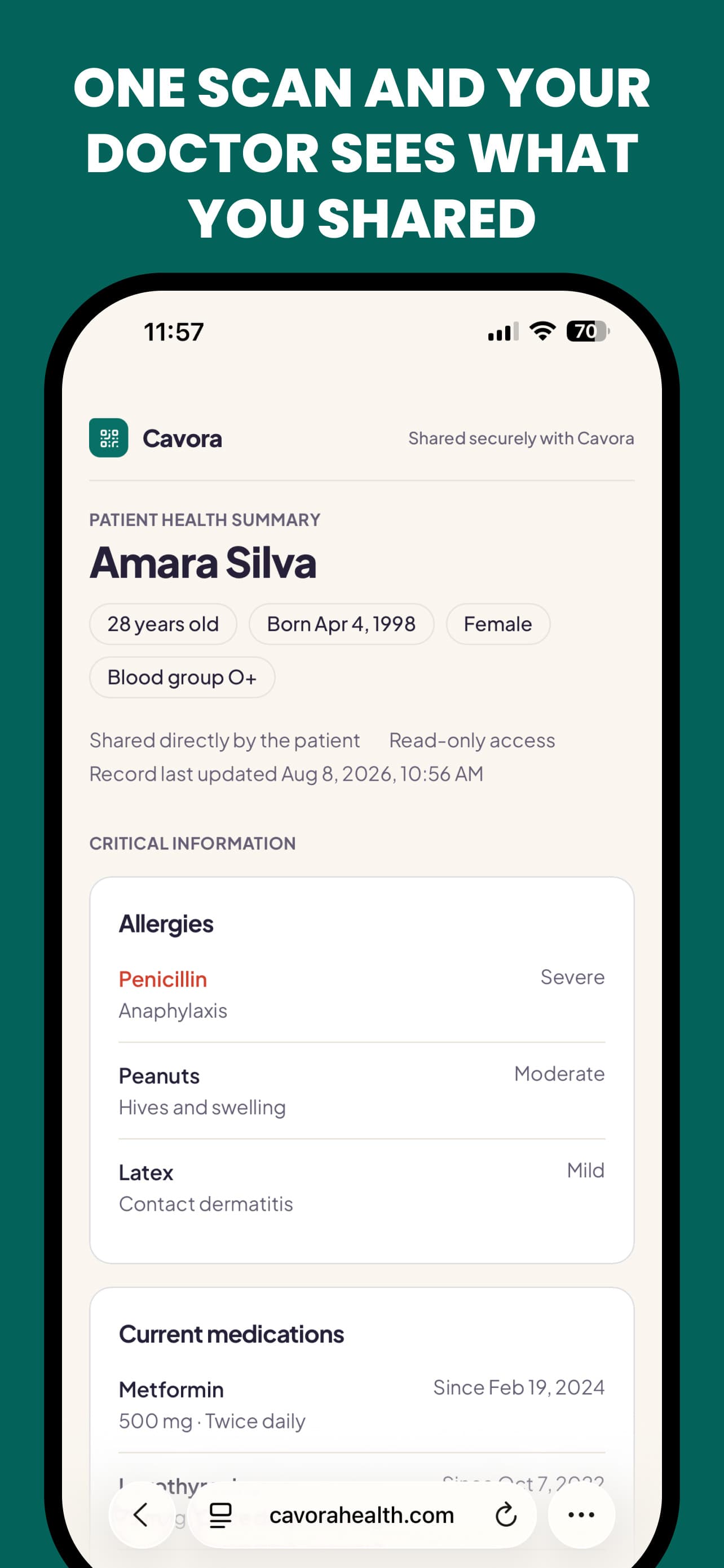
This is the part of the product everything else exists to serve, and it is designed around a hard constraint: the person receiving the record is standing in front of you with a queue behind them. They will not install anything. They will not create an account. They may be reading it off a screen you are holding.
So a share is not an integration. It is a code — a QR to scan, plus a six-digit fallback for the times a camera will not cooperate — that opens a read-only web summary, optionally behind a second code the patient reads aloud, and stops existing when the visit does. Expiry is chosen at creation: an hour, four hours, or a day.
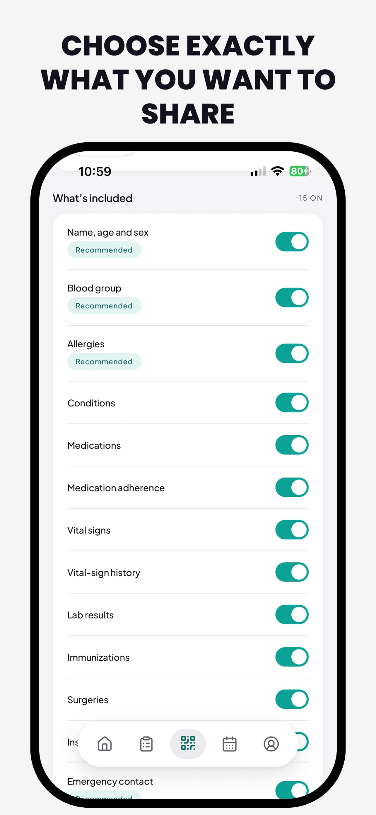
| Scope | What it carries | Why it is its own switch |
|---|---|---|
| Identity & blood group | Name, age, sex, blood type | Almost always on — it is the header of the summary a clinician reads first |
| Allergies | Substance, reaction, severity | Never off by default; it is the one field where omission is dangerous |
| Conditions | Active and historical, separately | Split because “had this once” and “living with this” are different clinical facts |
| Medications | Current, past, and adherence | Adherence is its own scope — patients are entitled to share what they take without sharing how consistently |
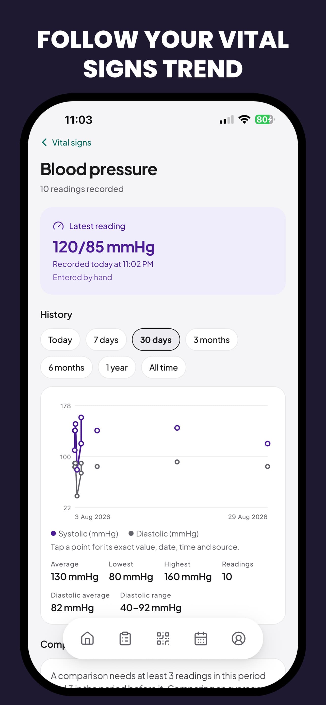
| Vitals & labs | Latest values, or the full history | Latest-only exists because a trend is a bigger disclosure than a number |
| Documents | Scanned letters, results, imaging reports | Off unless deliberately included — documents carry incidental information the patient may not have re-read |
Twenty scopes in total. The design principle underneath the list: a scope exists wherever a reasonable person might want one half of a category without the other. That is why medications split from adherence, and why vitals split from vitals history — a trend line reveals considerably more about someone's life than a single reading does.
Every share flow ends on a preview of the actual rendered summary, not a list of the toggles that were switched on. Reading back a settings screen tells you what you selected; reading back the document tells you what you disclosed — and those are different questions, especially for a scope like Documents where the content is a scan the patient may not have re-read in a year.
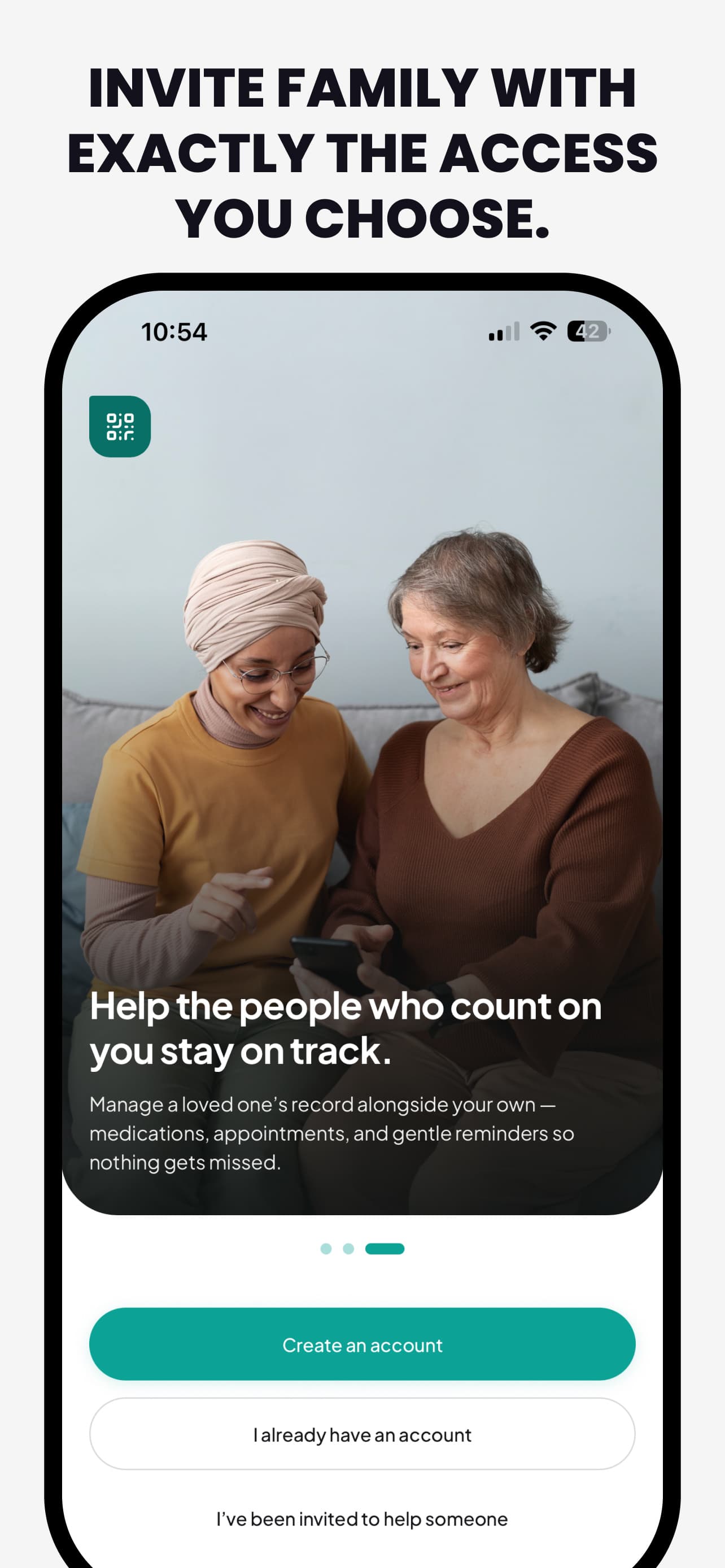
Access for a family member runs through the same permission model as a clinical share, with two differences: it persists, and it can be granted with edit rights. The invitation arrives as a link that opens the app through a Universal Link, and the recipient sees exactly the scopes they were given — a record switcher in the app makes "whose record am I looking at" a permanent, visible piece of chrome rather than a mode you can forget you are in.
Key screens
Design system
Cavora ships two clients. Before this pass they read as two products: the web app had a warm, distinctly branded palette; the mobile app had its own "quiet clinical warmth" identity — coherent, but not Cavora. The design system is now a port of the web app's language, with the web file as the source of truth wherever the two disagree.
Canvas
#F5F5F7
Grouped grey page
Ink
#18181B
True neutral near-black
Brand
#0CA396
Carries state
Brand deep
#077066
4.5:1 under white
Highlight
#E85D4A
The Add action only
Dark canvas
#0F0F13
Layered near-black
The canvas deliberately diverges from the web's cream: on mobile every neutral is genuinely neutral, so hue lives in the accents alone. Feature hues — the families that identify a kind of record — are pulled back from candy pastel to whisper tints, and they never grade a reading. Grading is what the semantic colours are for, and status is always colour plus wording.
- Plus Jakarta Sans throughout, set one register quieter than before. Extrabold is out of the scale entirely — bold carries headlines and metrics, semibold carries titles, and hierarchy below a headline is carried by the ink ramp before it is carried by weight.
- Radii run 12 for chips, 16 for fields, 20 for cards, 28 for sheets. Buttons are full pills, as on the web.
- Depth is tonal in light and border-drawn in dark: a white card on grey page needs no border, only a short contact shadow; in dark the tonal step is subtler, so the border-t border-line takes over.
- Real blur is reserved for the two things that genuinely float — sheets and the Add button — rather than sprayed across the interface as texture.
Not an inversion — a re-tune. The page is a neutral near-black with cards one step lighter, text is a near-white rather than pure white, and every accent is re-derived: vivid solids brighten a step and the text steps lift to pastel so they still clear 4.5:1 on their washes. Two things deliberately do not flip: the already-dark inverted surfaces, and the QR tile, which stays ink-on-white because the code is for a scanner, not a reader. The preference offers match-device, always-light, always-dark, and Sunset — dark from 19:00 to 07:00.
Key design decisions
| Decision | Rationale | Trade-off accepted |
|---|---|---|
| A share is a code with an expiry, not an account | The person receiving a record is a clinician in a ten-minute consultation, not a user acquiring a product. Anything that asks them to install, register or remember a password gets abandoned mid-visit. | The doctor's view is a web page the patient's phone hands over, so there is no clinician-side app to build features into later. |
| Twenty scopes, not one on/off switch | “Share my record” is not one decision. A physiotherapist needs conditions and procedures; an insurer arguably needs none of it. Granularity is the only honest answer. | A settings surface with twenty toggles is intimidating on first open, so it ships with a sensible default selection rather than an empty one. |
| The mobile app owns its own neutrals | The web app's cream reads as warmth on a desktop page and as a stain on a phone held at arm's length in a waiting room. The mobile canvas is Apple-Health grouped grey so the cards, not the background, carry the interest. | Two clients no longer match pixel for pixel; the palette is shared, the canvas is not. |
| The brand teal carries state, the coral carries one action | If a colour means three things it means nothing. Teal is progress, selection, completion. Coral appears on Add and on small celebratory moments and nowhere else, so a coral pixel is always an invitation to do something. | Nothing else in the app can borrow the accent when a screen feels visually flat. |
| One hero card per screen | The signature Cavora shape — a card with its top-left corner softened almost off — only means “this is the card that leads” if there is exactly one of them in view. | Screens that genuinely have two peers have to resolve that hierarchy in content rather than in shape. |
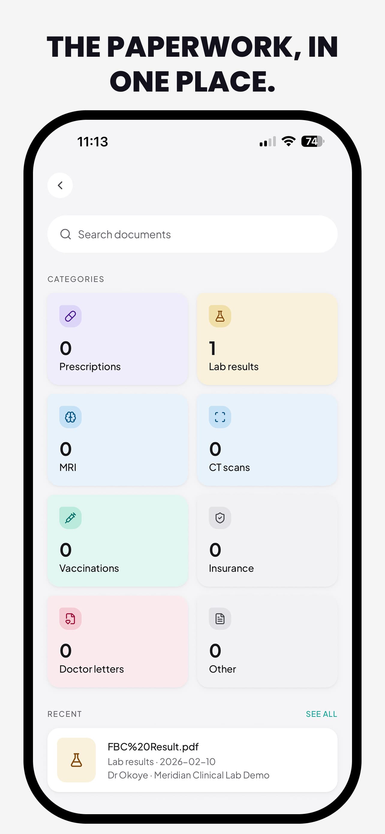
| Documents are a filing cabinet, not a timeline | A scanned insurance letter and a logged blood-pressure reading are different kinds of object. Forcing paperwork into a clinical timeline would have made both worse. | Two organising ideas for the user to learn instead of one — mitigated by the document model already carrying the timeline keys a future merge would need. |
Privacy & accessibility
- Biometric unlock sits in front of the record, and screen-capture protection covers the surfaces where a shared summary is on screen — the threat model for a health app includes the person standing behind you, not only the network.
- Sharing defaults to the narrowest thing that is still useful, and every share is listed, attributable and revocable from inside the app rather than only expiring on a timer.
- All text tones clear 4.5:1 against the surfaces they are actually paired with — checked per surface rather than per token, because a token that passes on white can fail on a tinted card.
- Status is never colour alone. A reading that is out of range says so in words and carries an icon, which matters both for colour vision deficiency and for the medical context, where an ambiguous red dot is worse than no signal.
- Feature hues identify a kind of record, never the severity of one — so a colour can be learned once and trusted everywhere.
Challenges & trade-offs
Two clients, one language, different canvases
Porting the web app's design language was the right call and still left a genuine conflict: the palette that reads as warm and branded on a desktop page reads as dinginess on a phone. The resolution — share the accents, let each client own its neutrals — means the two are no longer identical, and that has to be documented deliberately or the next contributor "fixes" it back.
Granularity versus the first-run experience
Twenty scopes is the honest number and an intimidating first screen. The compromise is a default selection that is clinically sensible rather than maximal, with the full list one tap away — but it is a compromise: a user who never opens the list is trusting my defaults with their medical history, which is exactly the kind of trust the product claims not to require.
Filing and timeline are two ideas, and users only wanted one
The document organiser is deliberately not the health timeline — filing and chronology are different jobs and merging them early would have degraded both. It is still two mental models where people expected one. The mitigation was structural rather than visual: the document model already carries the timeline, appointment, medication and provider keys, so unifying them later is a migration and a mapper rather than a reshape of a table that holds real patient files.
What's next
- Merging the document organiser into the clinical timeline now that both models have lived in production long enough to know which fields actually get used.
- Deeper HealthKit read-back, so wearable-captured vitals arrive on the calendar on the day they happened without a manual entry step.
- An Android client — the design system is already expressed as tokens rather than platform styles, which is most of that work.
- Clinician-side quality-of-life: a printable summary the doctor can put in their own file without asking the patient to re-share.
StintKeep
A shift tracker for people whose hours are their pay. One tap to start, live on the Lock Screen while you work, and a signable record at the end. No account, no servers.