Snoot
Brand and storefront for a vet-led pet company that sells food and medicine and runs a network of clinics. Two businesses, one site, and a voice that is warm without becoming a cartoon.
- Identity, packaging system, product design, front-end build
- HTML, CSS and JavaScript, hand-written
- Chillax, General Sans
- 2026
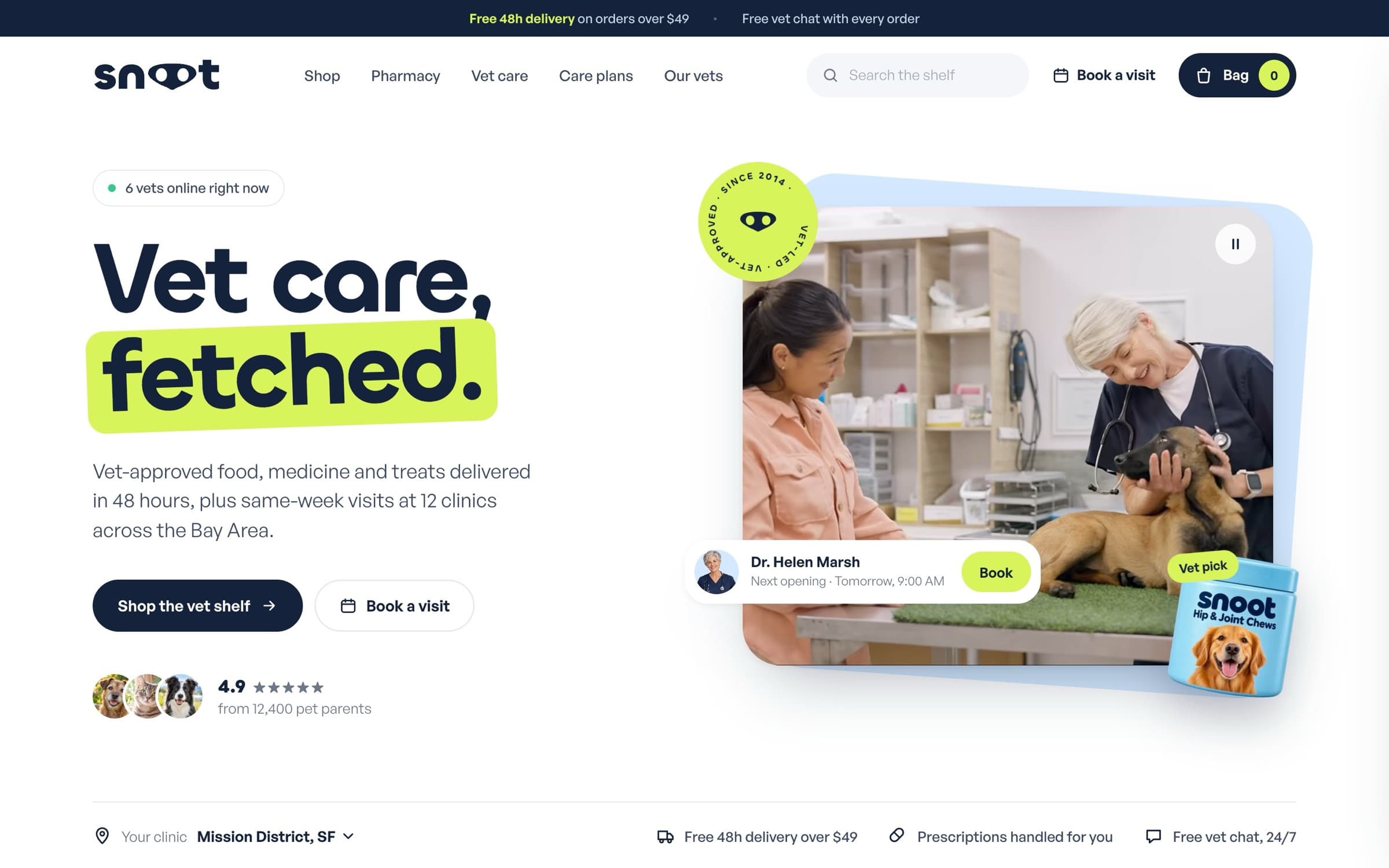
Snoot is a shop and a practice. People arrive to reorder flea treatment, or because their dog has been limping since Tuesday, and the site has to serve both without making either feel like an afterthought.
I designed the identity, the packaging system and the site, then built it. The wordmark's double o reads as a snout, a single acid lime does the brand work, and deep navy carries the clinical trust.
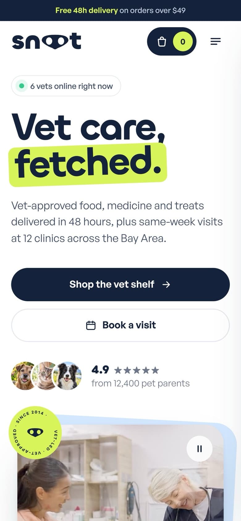
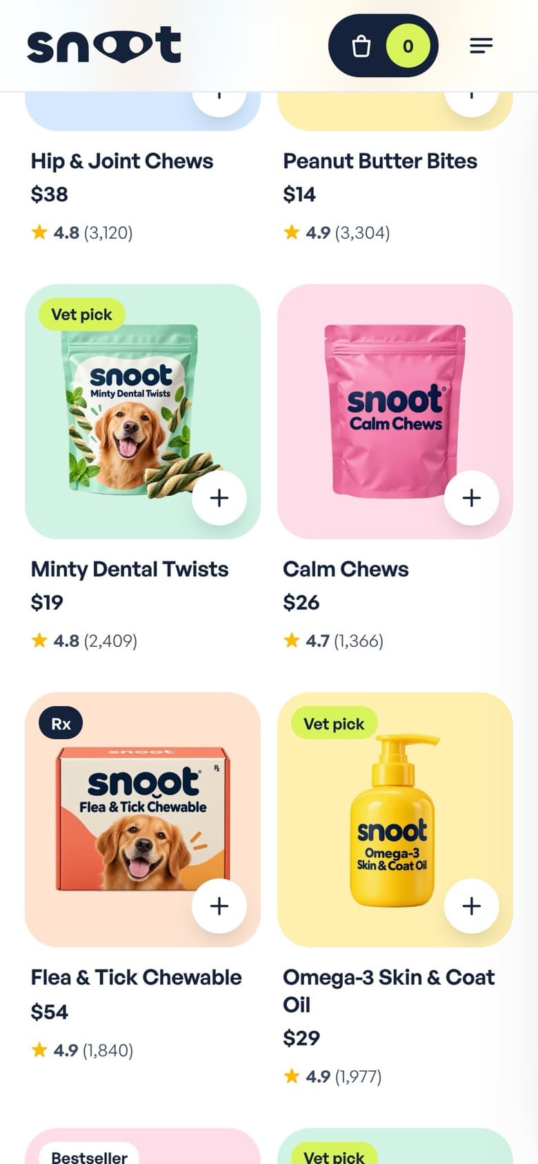
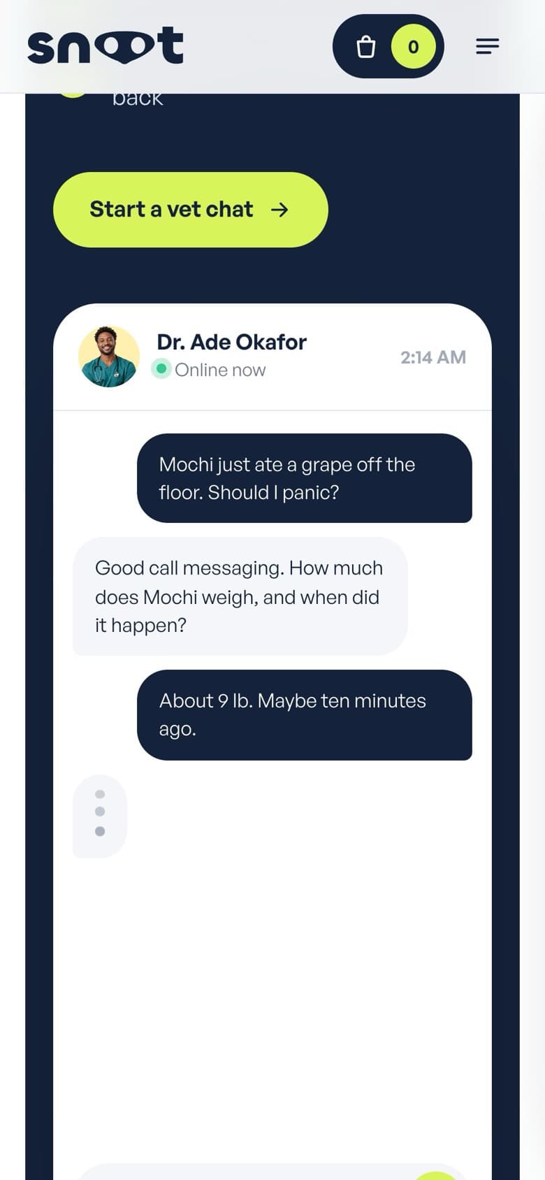
The same site at phone width. Each layout is composed for the small screen rather than scaled down.
One identity for a shop and a clinic
Lime is play, navy is care, and both appear on every page so neither business reads as a separate brand. Rounded geometric type keeps the tone friendly, and generous size keeps it legible for anyone reading on a phone in a waiting room.
Two journeys from the first screen
Shop the vet shelf and Book a visit sit side by side in the hero, and the clinic picker, delivery promise and prescription handling live in one strip beneath it. Nobody has to guess which half of the company they have landed on.
Commerce patterns, done properly
Category tiles, filterable products with ratings and quick add, Autoship and monthly care plans. The patterns are familiar on purpose. The brand is where Snoot is different, the checkout should not be.
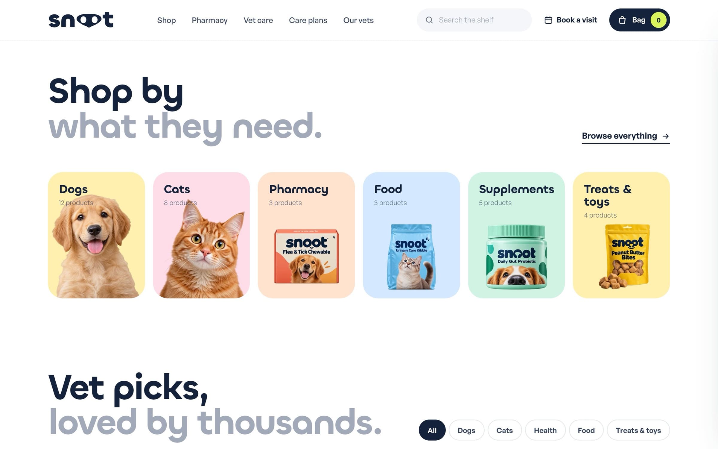
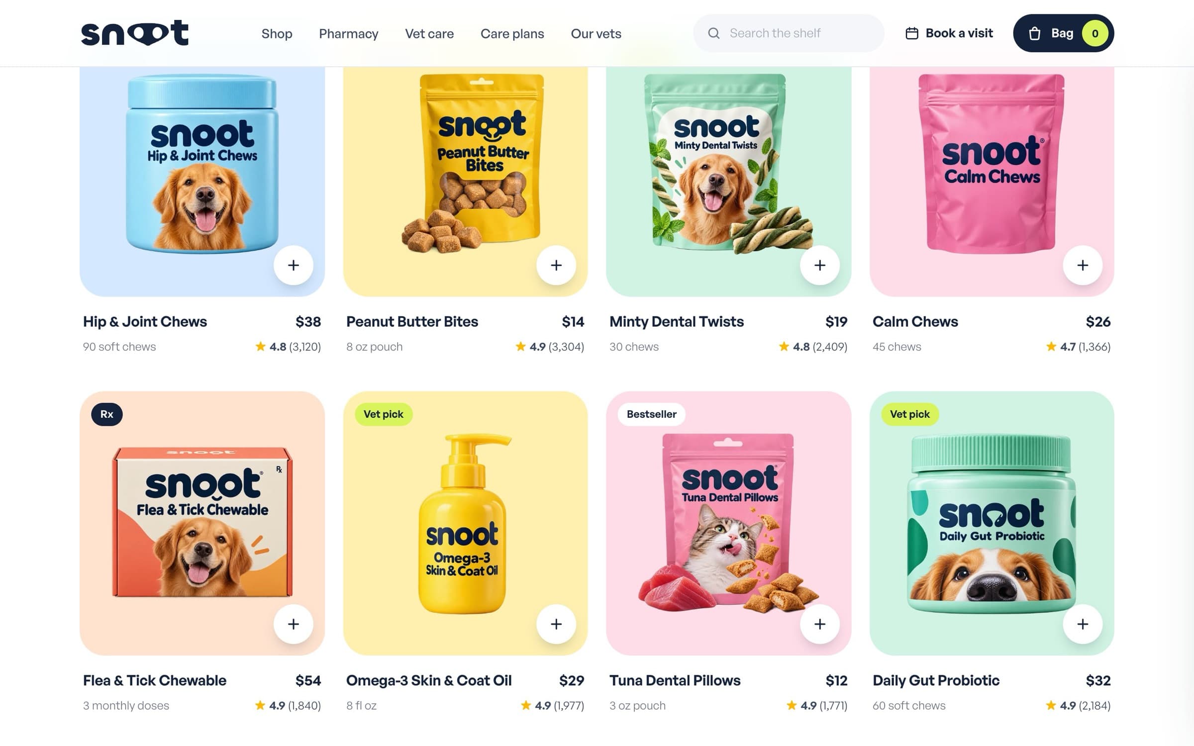
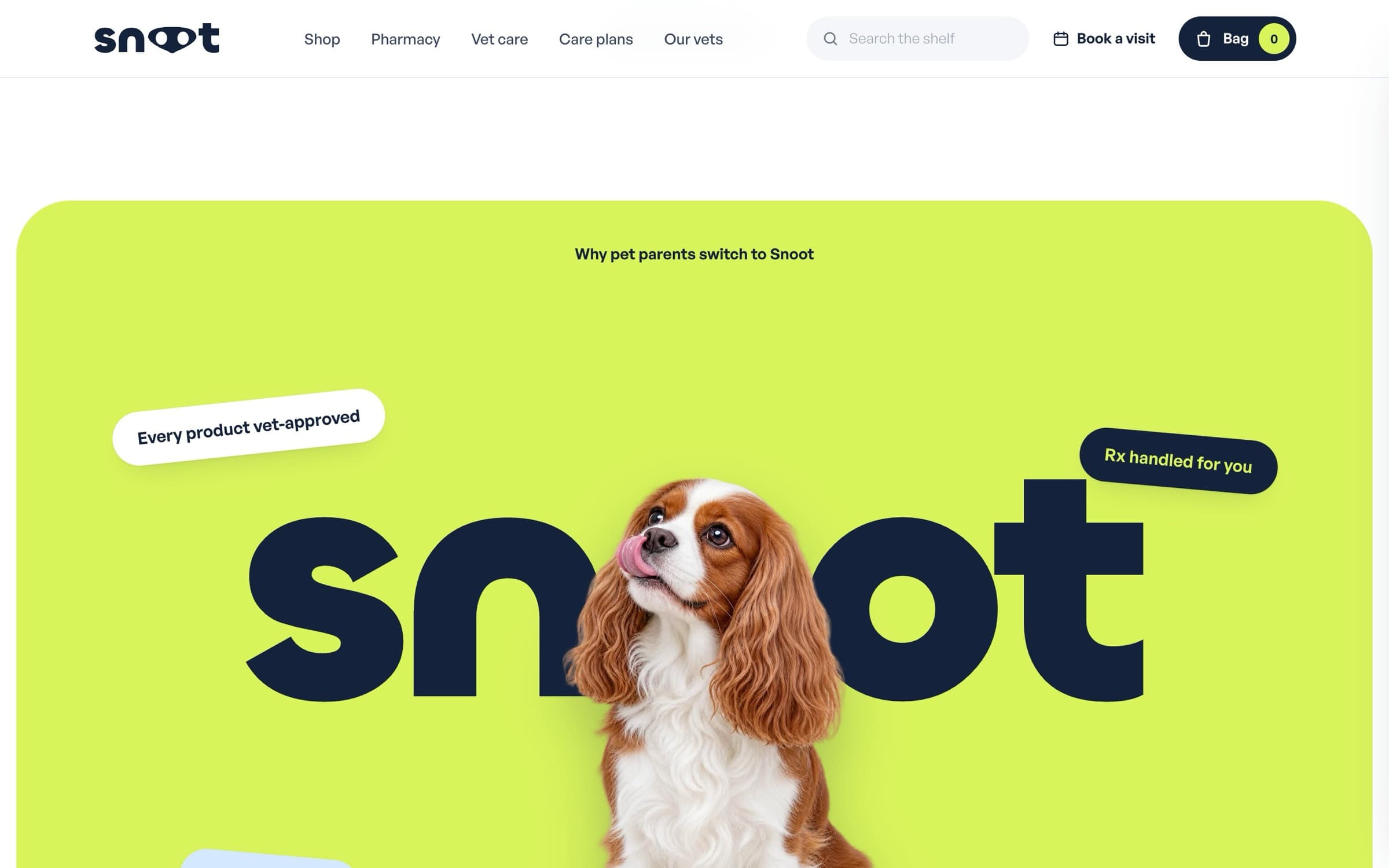
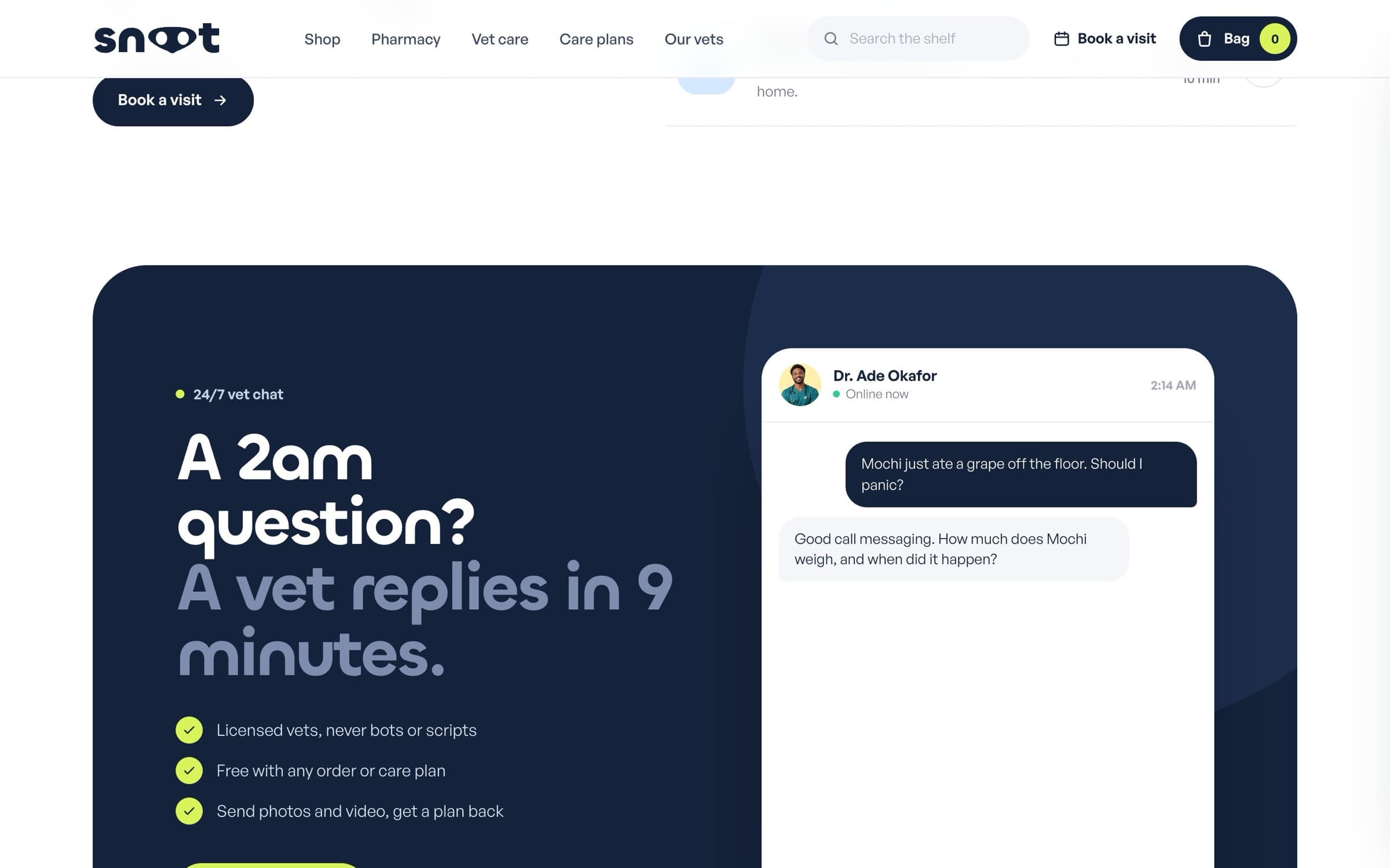
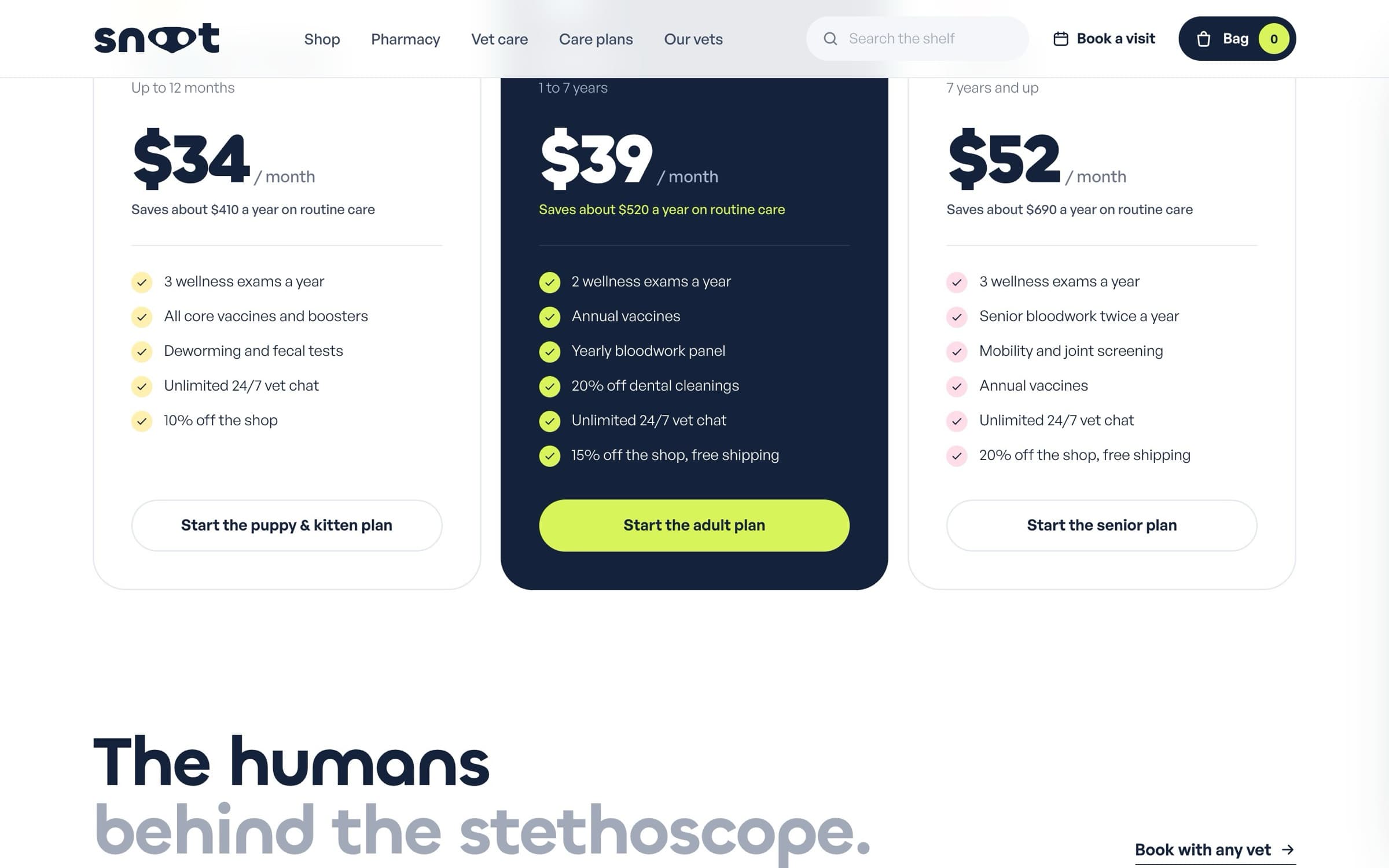
The design file, as it was built.
Pan and zoom the working file. Components, styles and every screen, live.
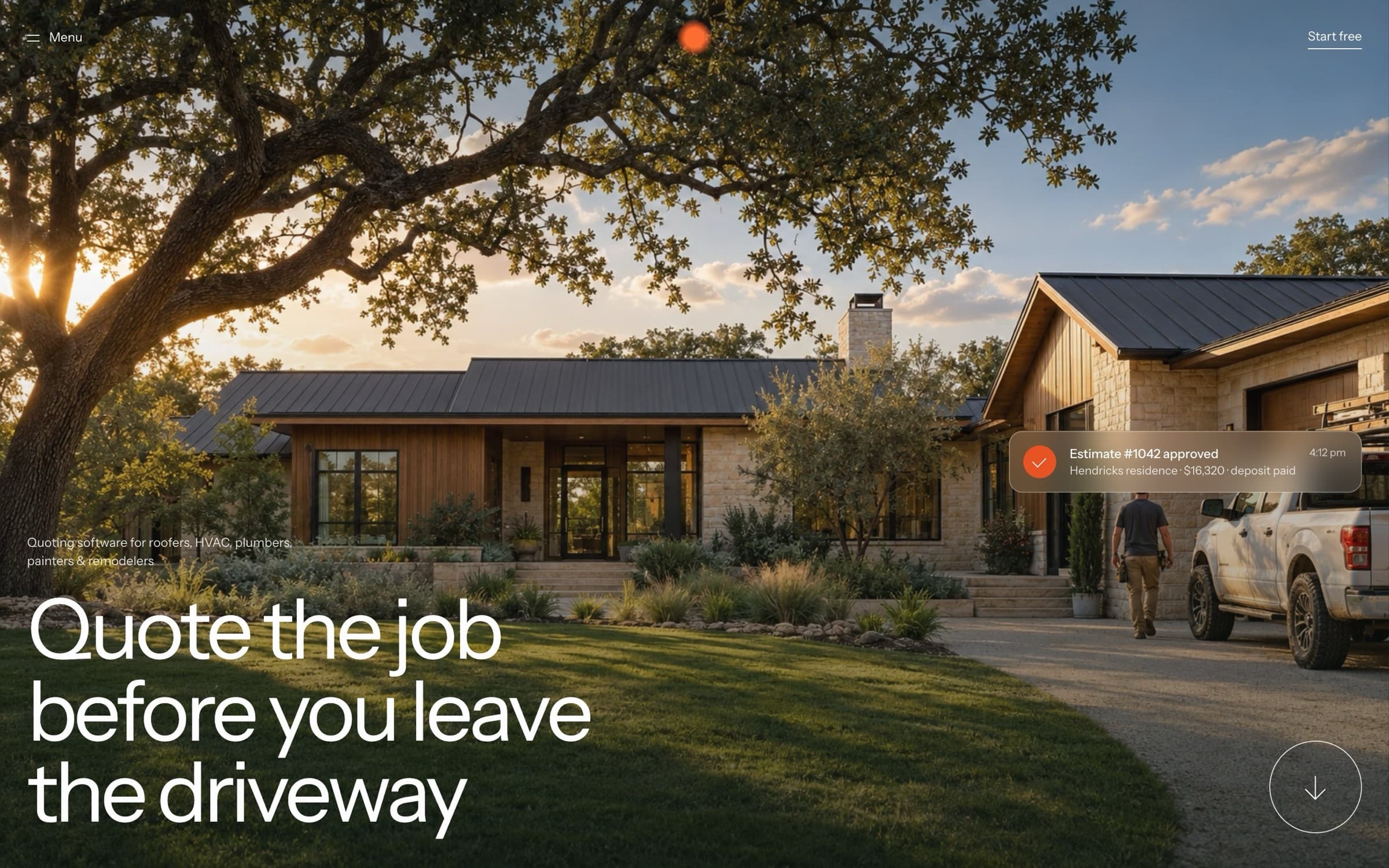
Plumbline
A product site for quoting software used by roofers, plumbers and HVAC crews. The buyers spend their day on job sites, so the site is built from their world instead of from dashboard screenshots.