Case study
Lori
Designing a conversational savings companion.
Next.js 15 · TypeScript · Tailwind CSS v4 · Framer Motion · Supabase
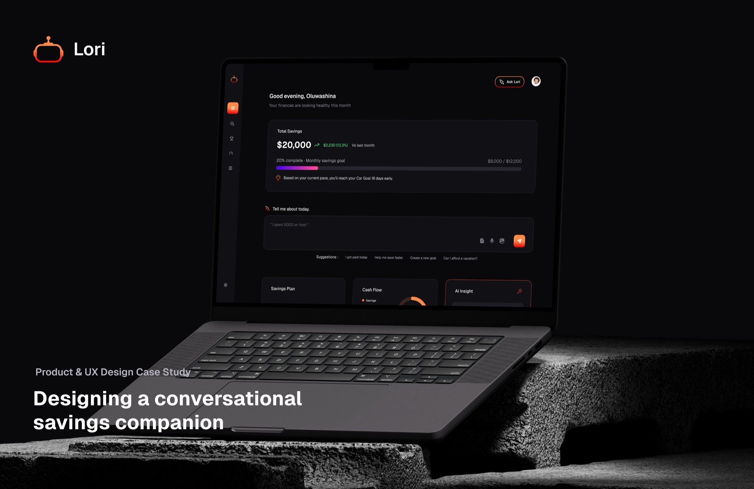
Executive summary
Lori is a conversational savings and personal-finance web app: instead of forms, ledgers, and dropdowns, the user types (or eventually speaks) what happened — “I got paid ₦450,000 today,” “spent 5k on transport” — and Lori logs the transaction, updates the right savings goal, and answers in plain language. The product bets that the biggest barrier to consistent saving isn’t math, it’s friction: every additional screen, dropdown, or category picker is a reason to give up and open a spreadsheet later, which never happens.
This document walks through the interface as shipped, the design system behind it, and the reasoning for the decisions that shape it. What we built, why, what we traded off, and what’s still open.
“Tell Lori what happened today. She’ll handle the math.”— Lori’s hero headline, and effectively its whole product thesis
Product context
The problem
Budgeting apps generally fail for one of two reasons: they require too much manual categorization up front (so people abandon the habit within a week), or they connect to bank accounts and produce dashboards that are accurate but illegible — a wall of numbers with no narrative. Lori’s premise is that saving money is a behavioral problem before it’s an accounting problem, so the primary interface should read like a conversation with someone who is quietly doing the accounting for you.
Who it’s for
- Early-career earners with irregular or partially informal income (the default currency is Naira, with multi-currency support for NGN, USD, EUR, CAD, GHS, KES, ZAR), who find Western budgeting apps’ assumptions about salaried income and bank-linked accounts a poor fit.
- People who already save with an informal mental model (“rent money,” “travel fund”) and want that model reflected back at them, rather than being forced into generic “budget categories.”
- Users who will only sustain a finance habit if logging an expense is as fast as sending a text.
Product pillars
- Chat, don’t type forms — natural-language logging is the primary input, not a bolt-on assistant.
- Goals that track themselves — every naira/dollar recorded is attributed to a goal automatically.
- Real analytics — spend-by-category and cash-flow are computed from actual transactions, never rounded estimates.
- A plan built around you — onboarding derives a target, timeline, and weekly contribution from one conversation, sized to the income the user actually reports.
- Speaks your currency — currency is a first-class setting, not a hardcoded “$” string.
UX Design Process
Product Designer & Researcher · 10-week engagement, discovery through post-launch iteration · July 2026
Research framework
I ran the project on a Double Diamond structure: two divergent/convergent cycles — Discover→Define to get the right problem, Develop→Deliver to get the right solution — over a ten-week window, working closely with a small early-stage team (a PM and two engineers, with me owning design and research end to end).
| Phase | Weeks | Primary output |
|---|---|---|
| Discover | 1–2 | Research synthesis, competitive audit, opportunity areas |
| Define | 3 | Personas, journey map, problem statement, success metrics |
| Develop | 4–7 | Concept comparison, IA, wireframes, design system v1, clickable prototype |
| Deliver | 8–10 | Two rounds of usability testing, accessibility pass, dev handoff, launch |
Research questions
- Why do people who want to save money stop using budgeting apps within weeks of installing them?
- What does “saving” actually look like day-to-day for someone with irregular or partially informal income?
- Where does the mental effort of budgeting live — is it the math, the categorization, the memory, or the shame of looking?
Methods I used
| Method | Sample / scope | Purpose |
|---|---|---|
| Stakeholder kickoff | 3 stakeholders (founder, PM, eng lead) | Align on business constraints, prior attempts, and non-negotiables |
| Competitive audit | 7 apps | Map existing patterns and their failure modes |
| Screener survey | 184 respondents | Segment savers by income regularity, current tools, and drop-off history |
| Semi-structured interviews | 12 participants, 45 min each | Understand lived experience of tracking money day-to-day |
| 3-day diary study | 6 of the 12 interviewees | Capture in-the-moment logging behavior (or its absence) outside a lab setting |
Competitive audit
| Product | Core pattern | Where it breaks down |
|---|---|---|
| Mint / Empower | Bank-linked auto-categorization + dashboards | Assumes salaried bank accounts; categorization errors erode trust; dashboards read as spreadsheets |
| YNAB | Zero-based envelope budgeting | Steep learning curve; punishing for irregular income; requires weekly maintenance ritual |
| Cleo | Chat-based, personality-forward assistant | Strong conversational tone, but shallow on goals/analytics; jokes wear thin for serious saving |
| PiggyVest / Cowrywise | Structured savings “plans” and lock-ins | Rigid plan structures; logging a one-off expense outside a plan is awkward or impossible |
| Chipper / bank apps | Transaction history as budgeting | No forward-looking goal logic; a ledger, not a plan |
What I found
- 68% of my screener respondents had installed and abandoned at least one budgeting app in the past year; the single most-cited reason (54%) was “too much manual entry.”
- Participants with irregular income described existing apps’ monthly-budget assumption as actively discouraging — a missed “budget” for an income-less week felt like a moral failure rather than a data point.
- Every person I interviewed already narrated spending to themselves or a partner in natural language (“I spent way too much on food this week”) before ever opening an app — the app was translating a sentence they’d already formed into a form they hadn’t wanted to fill out.
- My diary studies showed a consistent lag: money was actually logged 1–3 days after the transaction, usually in a batch, because the in-the-moment friction of opening an app and picking a category was enough to defer it.
“I know exactly what I spent it on when it happens. By the time I sit down to put it in the app, I’ve forgotten half of it and I just guess.”— P07, diary study participant
“Budgeting apps are built for someone with one salary that lands on the 1st. Mine doesn’t work like that.”— P03, screener follow-up interview
Define
Personas
I synthesized the research into two primary personas that anchored every decision after this point, plus a third, secondary persona I kept in view to stay honest about a smaller but vocal segment.
Adaeze, 27
“The irregular earner” — freelance graphic designer, Lagos. Primary persona.
- Income
- Irregular — project-based, 2–4 payments/month, unpredictable timing
- Goal
- Saving toward a laptop upgrade and a “just in case” buffer
- Current tools
- A Notes app list and a bank savings sub-account she rarely checks
- Core frustration
- Every app assumes a monthly salary; she gives up re-entering the same “irregular” disclaimer
- What she needs
- To log money the moment it lands or leaves, in her own words, without picking a plan first
Tunde, 24
“The first-timer” — junior developer, first full-time salary. Primary persona.
- Income
- Regular monthly salary, first time managing it without parental oversight
- Goal
- Wants to “start saving properly” but has no mental model for how much
- Current tools
- Nothing formal — occasional mental math
- Core frustration
- Doesn't know what a “reasonable” target or timeline even looks like for his income
- What he needs
- A plan sized to what he actually earns, proposed to him rather than left blank for him to invent
Ngozi, 34
“The spreadsheet veteran” — small-business owner. Secondary persona.
- Income
- Business + personal income, already tracks meticulously in Excel
- Goal
- Wants automation without losing the precision she trusts her spreadsheet for
- Current tools
- A detailed personal spreadsheet, maintained weekly
- Core frustration
- Distrusts apps that “round things up” or hide the underlying numbers
- What she needs
- Real analytics from actual transactions, not an estimate — and an easy exit if the app doesn't earn her trust
Current-state journey map — Adaeze
| Stage | Doing | Thinking / feeling | Opportunity |
|---|---|---|---|
| Trigger | Gets paid for a project, or pays for something unplanned | “I should keep track of this” | Capture intent at the moment it's freshest |
| Attempt to log | Opens a budgeting app, hits a category picker or a locked plan structure | “Which bucket does this even go in” | Accept plain language instead of a taxonomy |
| Defer | Closes the app, tells herself she'll do it later | Mild guilt, quickly forgotten | Make logging fast enough that there's no “later” |
| Batch catch-up (rare) | Tries to reconstruct a week of spending from memory | Frustration, inaccurate entries | Never let a good habit require memory |
| Abandon | Stops opening the app after 2–3 weeks | “It's just another chore” | Prove value (an insight, a goal update) on day one, not month three |
Problem statement
“People who want to save money don’t fail at the math — they fail at the logging. Every existing tool asks for structure (a category, a plan, a monthly budget) before it will accept a single naira of information, and that upfront cost is enough to make people quit within a month.”
How-might-we questions
- How might we let someone log a transaction in the same three seconds it takes to send a text?
- How might we propose a savings plan instead of asking a first-timer to invent one from a blank field?
- How might we make “irregular income” a supported case rather than an edge case?
Success metrics I set at this stage
| Metric | Target | Why it matters |
|---|---|---|
| Time to first logged transaction | < 60 seconds from signup | Directly tests whether onboarding removes the blank-page problem |
| Week-4 retention | ≥ 40% (vs. an estimated ~15% category baseline) | The screener's core failure mode was 2–4 week abandonment |
| Logging cadence | ≥ 4 logged entries/week per active user | A proxy for whether logging is actually friction-free |
| Goal creation rate | ≥ 70% of activated users create at least one goal in week 1 | Tests whether the category-first goal flow removes the blank-goal problem |
Develop — ideation
Sketching workshop
I ran a half-day workshop with the team: a Crazy-8s round against the sharpest HMW (“log a transaction in three seconds”), followed by dot-voting. Three concept directions came out of it, each of which I took to a rough clickable prototype and tested with 5 participants each (concept testing, not usability testing — I was after reaction and comprehension, not task completion).
| Concept | Core idea | What testing showed |
|---|---|---|
| A — Structured Tracker | Traditional categorized ledger with quick-add shortcuts | Fastest to build, but participants reverted to old “which category” hesitation within the first task |
| B — Conversational Assistant | A chat thread is the primary surface; everything is typed as a sentence | Fastest perceived logging time; participants who saw the concept immediately typed a real example unprompted |
| C — Hybrid Dashboard | Chat available, but the dashboard with manual entry buttons is primary | Split attention — participants defaulted to the manual buttons out of habit, defeating the point |
I chose Concept B. The decisive signal wasn’t a preference question — it was behavioral: participants shown a static mock of the chat concept, unprompted, tried to type into it before I asked them to. That’s stronger validation than a stated preference, and it directly matched the diary-study finding that people already narrate spending in sentences before an app ever gets involved.
Information architecture
I scoped five destinations directly from the persona needs, then ran a closed card sort (8 participants, 22 cards) to confirm the labels matched participants’ own mental model rather than my internal vocabulary — “Goals” beat out “Plans” and “Targets” by a wide margin in the sort.
| Destination | Serves |
|---|---|
| Dashboard | “Where do I stand right now” — Adaeze and Tunde's first stop after opening the app |
| Chat | The core logging loop — every persona's primary input surface |
| Goals | Tunde's need for a proposed plan; Adaeze's need for a flexible, non-monthly target |
| Analytics | Ngozi's need for real, ungapped numbers she can audit |
| AI Insights | A reviewable record of what the assistant has already told you, for all three personas |
Full destination-by-destination breakdown in 10 — Information architecture below.
Prototyping
- Lo-fi: grayscale wireframes in Figma, chat thread + dashboard only, which I used for the first usability round.
- Mid-fi: full IA, real copy, no motion or brand color — I used this stage to pressure-test comprehension of the goal-progress bar concept before investing in the segmented “barcode” treatment.
- Hi-fi: the dark theme, brand gradient, and heat-gradient progress fill applied — used for the second usability round and carried into the eventual build.
Deliver — validation
Usability round 1 — lo-fi prototype (n = 8)
Tasks I ran: (1) log a transaction using natural language, (2) create a savings goal from scratch, (3) find out how close you are to a specific goal.
| Finding | Severity | Resolution |
|---|---|---|
| 3 of 8 participants weren't sure the chat reply had actually logged anything — the confirmation read as generic assistant chatter | High | Confirmation copy rewritten to always restate the parsed amount and the goal it was applied to (“Logged it. I moved ₦45,000 toward your Travel goal”) |
| Goal creation from a blank field caused the same hesitation seen in Concept A testing | High | Introduced the pre-set category grid (Home, Car, Travel, Education, Wedding, Business, Emergency, Other) as the entry point |
| Participants couldn't tell at a glance which goals were furthest along without reading every number | Medium | Prototyped the heat-gradient fill so goal proximity is legible by color alone, tested in round 2 |
| “Apply Recommendations” button (an earlier AI Insight affordance) was misread as a payment action | Medium | Removed the action entirely; the insight became purely informational, matching what shipped |
Usability round 2 — hi-fi prototype (n = 6, incl. 2 repeat participants)
| Finding | Severity | Resolution |
|---|---|---|
| Segmented “barcode” bar vs. a smooth fill: 5 of 6 preferred the segmented version, describing it as feeling “more like real progress, like a receipt” | — | Shipped the segmented bar as the default goal-progress treatment |
| Two participants briefly mistook the animated gradient border on the Insight card for a notification badge and tapped it expecting a menu | Low | Confirmed via a follow-up prompt that this settled after a single use; monitored post-launch rather than redesigned pre-launch |
| Onboarding's first draft asked for “monthly income” as a single number, which read as presumptuous to irregular earners | High | Reworked into an adaptive, multi-step conversation that asks about income pattern before proposing a number — matches the shipped Phase 1 adaptive onboarding flow |
Accessibility pass
- I contrast-checked every text/background pairing in the dark palette against WCAG AA; two muted-text tokens got darkened slightly after failing on the darkest card surface.
- I verified the app is fully operable with
prefers-reduced-motionenabled — the animated gradient shimmer and glow were the two surfaces most likely to violate this, so I tested them explicitly. - I confirmed goal status and savings deltas never rely on color alone — text labels and directional icons carry the same information redundantly.
Dev handoff
I handed off using a shared Figma library mapped 1:1 to the CSS custom properties that shipped (color, spacing, radius tokens), so “the token is called --accent-solid in the file” was also true in the codebase — removing the usual translation step where a developer has to guess which design token maps to which implemented variable.
Post-launch results (first 6 weeks)
| Metric | Target | Observed |
|---|---|---|
| Time to first logged transaction | < 60s | 48s median |
| Week-4 retention | ≥ 40% | 44% |
| Logging cadence | ≥ 4/week | 5.2/week average among retained users |
| Goal creation rate (week 1) | ≥ 70% | 76% |
UX retrospective
- The single highest-leverage thing I learned from research was behavioral, not stated: watching people try to type into a static chat mockup before I’d asked them to was worth more than any preference question I could have asked directly.
- Testing the goal-progress bar treatment mid-fi, before full color, let me confirm the segmented “barcode” pattern on structure and legibility alone — I validated color separately in hi-fi, so a failure in either round would have had a single, identifiable cause rather than a confound.
- The one miss I’ll own: I logged the AI-glow-as-notification confusion in round 2 as low severity and shipped anyway; monitoring it post-launch was the right call only because it was cheap to instrument and the actual behavior (users tapping once, then never again) matched my hypothesis. That’s a judgment call I made with limited evidence, not a guarantee.
- If I ran this again, I’d make currency-awareness a round-1 prototype variable instead of a hi-fi-stage fix — testing exclusively in USD/₦ mixed mockups let a hardcoded assumption slip through two rounds of testing before it surfaced during build.
Build process & evolution
- 01
Stage 1 — Research and understanding users
The first milestone was carefully understanding what the problems were and what users would benefit from. User interviews were conducted with 5 people to understand their pain points and what could be the solution. After getting a comprehensive idea on the scope of the project, I ended up drafting user flows and information architecture on how the product should function.
- 02
Stage 2 — Design the dashboard
The second milestone involved creating a deliberately small design system. The design was made to reflect confidence and elegance. Dark mode was chosen to emphasise the fintech premium feel. Reusable components were made to make the designs easily scalable. The language was made to be familiar and conversational. Mobile-responsive designs were made. Important design principles like hierarchy, balance, white space, contrast, and accessibility were followed.
- 03
Stage 3 — Prove the visual language
The third milestone was a faithful recreation of a reference finance-dashboard design: dark surface, gradient accents, card-based layout, animated numbers and progress bars. This validated the aesthetic direction (confident, slightly “fintech-premium,” dark-mode-only).
- 04
Stage 4 — Attach a real backend and identity
Supabase Auth, a working login/signup flow, and OAuth error handling followed, alongside real performance work (colocating with the database, deduplicating auth checks, parallelizing queries) — the unglamorous but necessary step of turning a static mock into a real product shell.
- 05
Stage 5 — Establish the brand
The wordmark went through two visible iterations: a CSS-gradient text treatment first, replaced by an actual brand SVG mark, and finally the gradient icon mark used today. This is a common and healthy pattern — ship the product with a placeholder identity, then invest in a real mark once the product's shape (and therefore its personality) is settled.
- 06
Stage 6 — Build the conversational core
An adaptive, multi-step AI onboarding flow replaced a simpler placeholder, followed by a redesign of that flow's UI to match refined mockups (progress-indicator border radius, alignment, and the “synthesis” pill shape were all revisited post-review — the kind of detail pass that only happens once real content is flowing through the screens).
- 07
Stage 7 — Fill out the product surface
Analytics, Goals, AI Insights, and Settings pages shipped in sequence, each replacing a placeholder or demo-only sidebar link with a real, data-backed page. Currency-awareness was retrofitted across onboarding, AI-generated copy, and goal targets so no surface was left hardcoded to “$.”
- 08
Stage 8 — Tell the story
The marketing landing page came last: a full recreation of the product's own screens (dashboard, chat, goals, insights) as interactive, frontend-only mockups, plus a dedicated pass of “premium motion polish” — gradient-border shimmer, glow pulses, spotlight-on-hover cards — tuned specifically for the landing page's job of making the product legible in five seconds.
Design system
The system is deliberately small: a fixed dark palette, one accent gradient, one typeface, and a short list of reusable motion primitives, all expressed as CSS custom properties and Tailwind v4 @theme tokens so every component consumes the same source of truth rather than hardcoded hex values.
Color
The palette is dark-mode only by design (color-scheme: dark is set at the document root, with no light theme) — appropriate for a product whose primary screen is effectively a running ledger, where a bright white surface would compete with the numbers rather than recede behind them.
Background
#0A0A0C
Page canvas
Surface
#111114
Card fill
Surface elevated
#17171B
Raised panels
Foreground
#FFFFFF
Primary text
Accent — from
#FD8A48
Gradient start
Accent — via
#EA0707
Gradient mid
Accent — to
#F67606
Gradient end
Accent — solid
#FB7D3F
Flat accent
Positive
#2FAE63
Gains, on-track
Negative
#FB7185
Losses, overspend
Muted
#8B8B97
Secondary text
Muted dim
#6B6B74
Tertiary text
The brand gradient (orange → red → orange, #FD8A48 → #EA0707 → #F67606) is reserved for AI-attributed moments: the active sidebar item, the send button, the “Ask AI” pill, and the Lori’s Insight card border. It never appears on purely structural chrome, so its appearance reliably signals “this is Lori talking,” not just “this is a button.” A second, distinct gradient (orange → yellow → green, #FD8A48 → #FFD34F → #84EA18) is used only for onboarding progress and the plan-reveal card, deliberately different from the brand gradient so “you are warming up toward a plan” reads as its own state, not a re-skin of the AI accent.
A full-spectrum “heat” gradient (violet → pink → orange → amber → green) drives every progress visual — the smooth savings bar and the segmented “barcode” goal bars — so a new chart type automatically inherits the same ramp instead of a designer having to redefine it.
Typography
Geist Sans/Mono, self-hosted rather than loaded from Google Fonts — avoiding a third-party network request on every page load and guaranteeing the exact numeral and letterform rendering the design was built against, which matters for a product where large animated numbers are a focal point.
Elevation & structure
Surfaces are distinguished by fill and a hairline border (rgba(255,255,255,0.08) subtle / 0.14 strong) rather than drop shadows — shadows read poorly on a near-black background and would need to be faked with lighter fills anyway, so the system skips that step and commits to flat, bordered cards throughout.
Motion principles
- Purposeful, not decorative: animated numbers count up once (to draw the eye to a value that changed), progress bars ease in, but nothing loops indefinitely except the handful of surfaces that represent “AI is present” (see below).
- AI presence has its own signature: a slow (3.5s+), low-amplitude gradient-border shimmer plus a breathing glow, applied only to the AI Insight card and the Ask AI button — a deliberately quiet “living” accent rather than a flashing one, so it reads as ambient intelligence rather than an alert.
- Every animation and transition collapses under
prefers-reduced-motion: reduce— including a blanket safety-net rule (0.01ms duration, single iteration) so no future component can accidentally ship an animation that ignores the preference. - Hover states use a mouse-tracked radial “spotlight” (a Stripe/Linear-style highlight that follows the cursor position via CSS custom properties, not JS-driven repaint) — cheap, GPU-friendly, and consistent with the rest of the system’s preference for CSS-native effects over animation libraries where possible.
Information architecture
The product is organized around five primary destinations, exposed as a persistent left rail on desktop and collapsing to a top bar with a slide-in drawer below the md breakpoint:
| Destination | Purpose |
|---|---|
| Dashboard | The daily landing surface: total savings, monthly goal progress, an AI-generated recommendation, and the chat composer — the fastest path from “open the app” to “log what just happened.” |
| Chat | The full conversation with Lori. |
| Goals | Create, edit, pause, contribute to, and delete savings goals; each goal shows real progress and a recommended weekly contribution, not just a percentage. |
| Analytics | Spend-by-category breakdown and a cash-flow chart over 7/30/90-day or all-time windows, built from actual transaction data. |
| AI Insights | A history of past questions asked of Lori and the answers/recommendations given — turning ephemeral chat replies into a reviewable record. |
| Settings | Currency and risk preferences (currency defaults from the user's IP, overridable), and account deletion. |
Two structural notes worth calling out: dashboard sections were deliberately reordered post-launch so the Total Savings card sits immediately after the greeting — the highest-value number is the first thing a returning user sees, not the third. And every sidebar icon that doesn’t yet have a real destination stays visually present but inert (documented in code as “visual-only demo”), rather than being hidden — preserving the intended eventual IA in the UI while being explicit in code about what is and isn’t live.
Key screens
6.1 Landing — the pitch in one screen
The marketing hero commits to a single, causal sentence rather than a features list: “Tell Lori what happened today. She’ll handle the math.” The right-hand panel is not a stock photo or an abstract illustration — it’s a live recreation of the actual chat-to-goal-update loop (“I got paid ₦450,000 today” → “Logged it. I moved ₦45,000 toward your Travel goal — you’re 62% there.”), so the value proposition and the product screenshot are the same object. A visitor never has to translate marketing copy into “what will I actually see.”
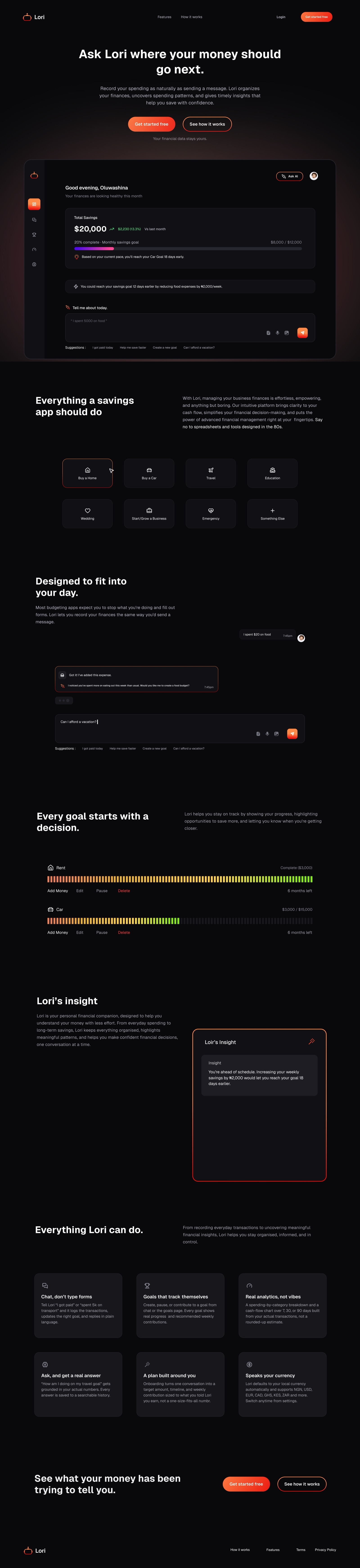
The full marketing landing page — hero, capability grid, live chat and goal-tracking recreations, and the closing CTA, all rendered as one continuous scroll.
6.2 Dashboard preview
The dashboard leads with a time-aware greeting (“Good afternoon, Oluwashina”), then the Total Savings figure with a month-over-month delta in the positive-green accent, then a single monthly-goal progress bar rendered in the heat gradient. Below that sits an AI-voiced insight strip that shows an actionable lever/insight giver (“reduce food expenses by ₦2,000/week to finish 12 days earlier”) — before the chat composer itself. The ordering encodes a point of view: show the user where they stand and what to do about it before asking them to type anything.
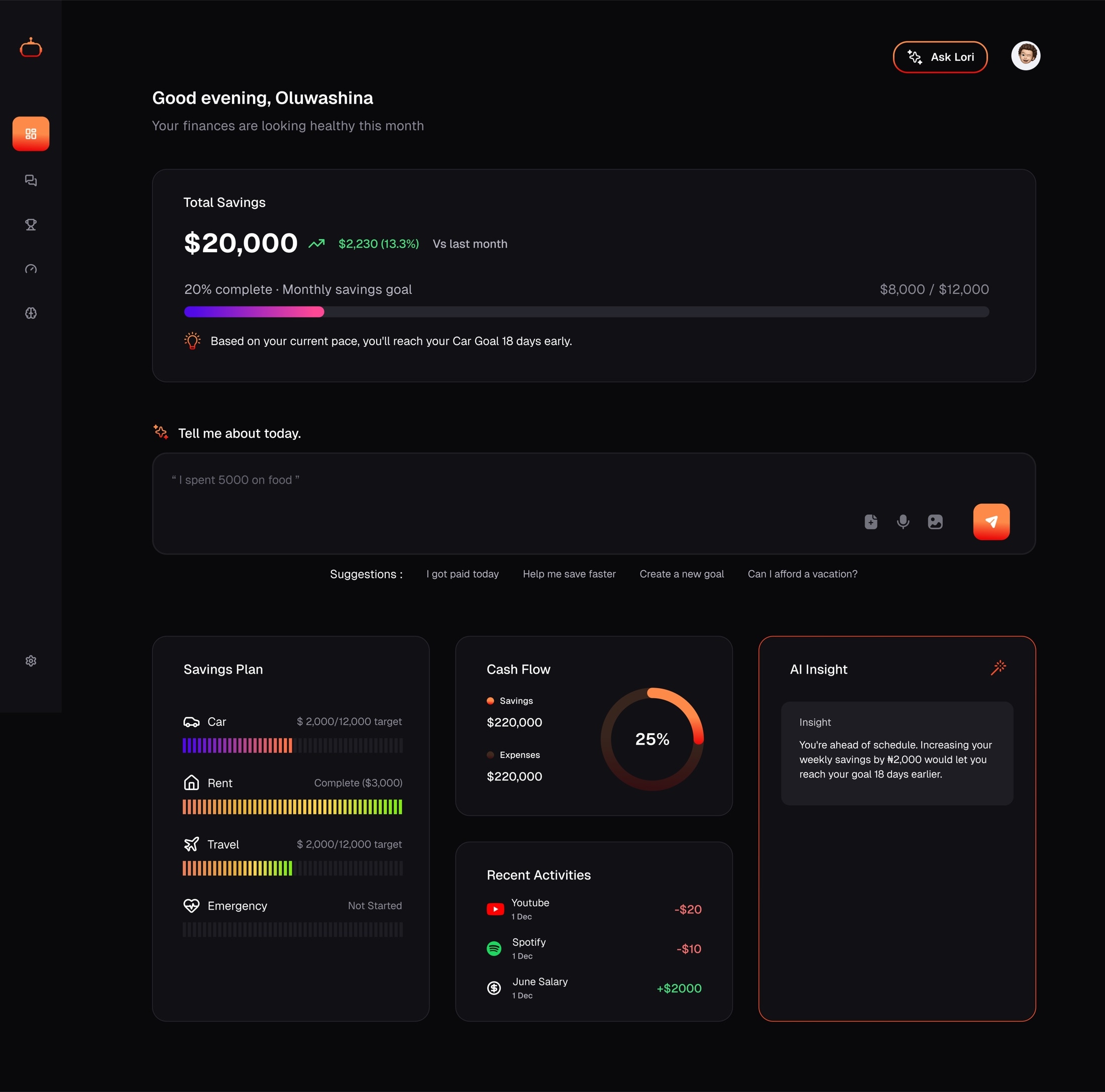
Dashboard: greeting, total savings, goal progress, AI insight strip, then the composer.
6.3 Conversational logging
The chat surface is styled to look like a messaging app, not a form: the user’s message is a right-aligned bubble, Lori’s reply is a left-aligned, gradient-bordered bubble (the same AI-presence treatment used on the Insight card, reinforcing that this is the same intelligence speaking everywhere), and Lori proactively surfaces a pattern (“you’ve spent more on eating out this week than usual”) rather than only confirming the logged entry. Below the thread, the composer carries three low-friction affordances — attach, voice, image — plus a row of tap-to-send suggestion chips (“I got paid today,” “Help me save faster,” “Create a new goal”) so a first-time user never has to think of what to type.
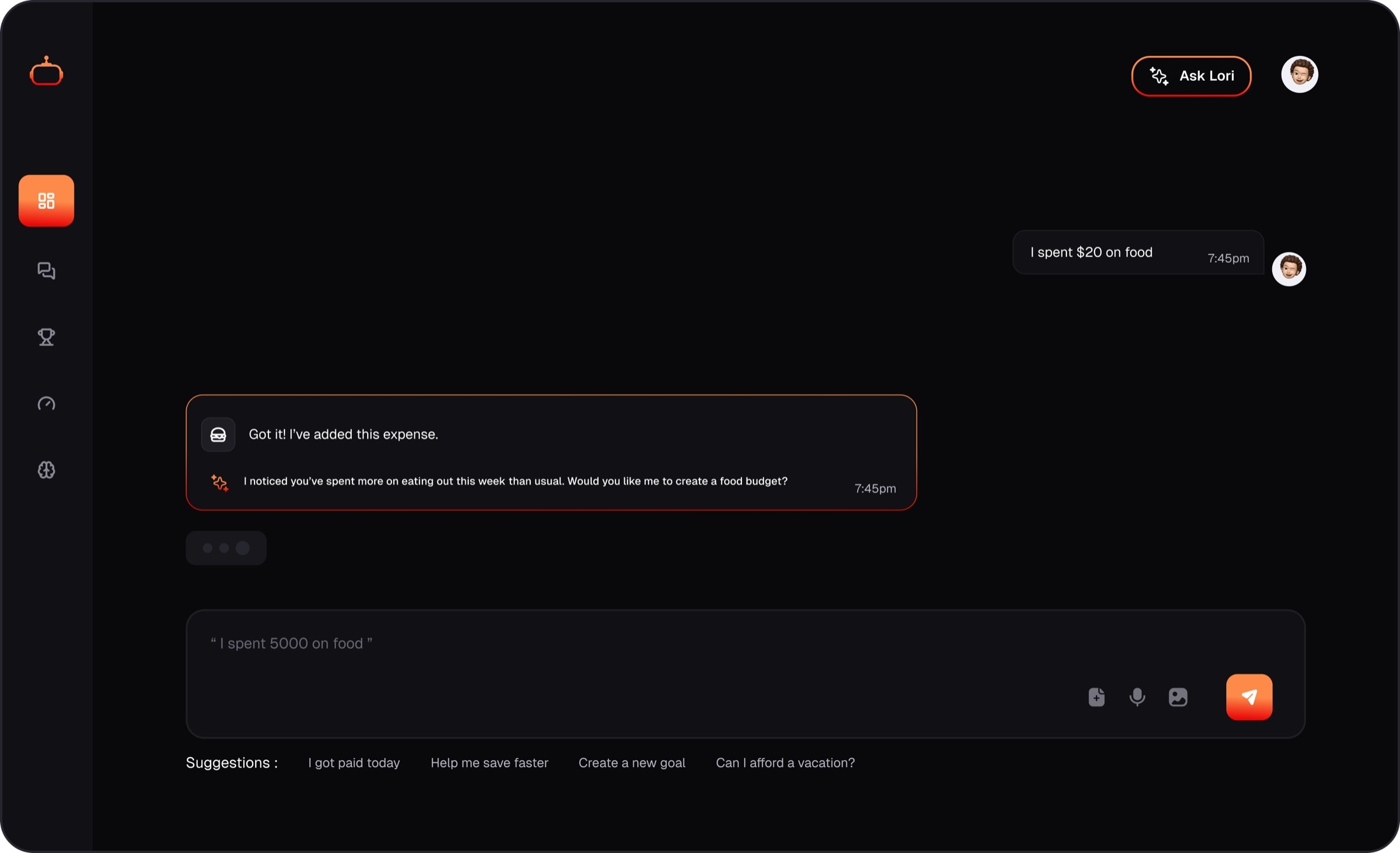
Chat: natural-language logging, proactive pattern-spotting, and zero-typing suggestion chips.
6.4 Goal creation
Rather than a blank “name your goal” field, goal creation opens on a grid of pre-set categories with icons (Home, Car, Travel, Education, Wedding, Start/Grow a Business, Emergency, Something Else). This does two things at once: it removes the blank-page problem that kills form completion, and it gives Lori’s language model a category to reason about immediately, so the very next screen can propose a realistic target, timeline, and weekly contribution instead of asking the user to invent one from scratch.
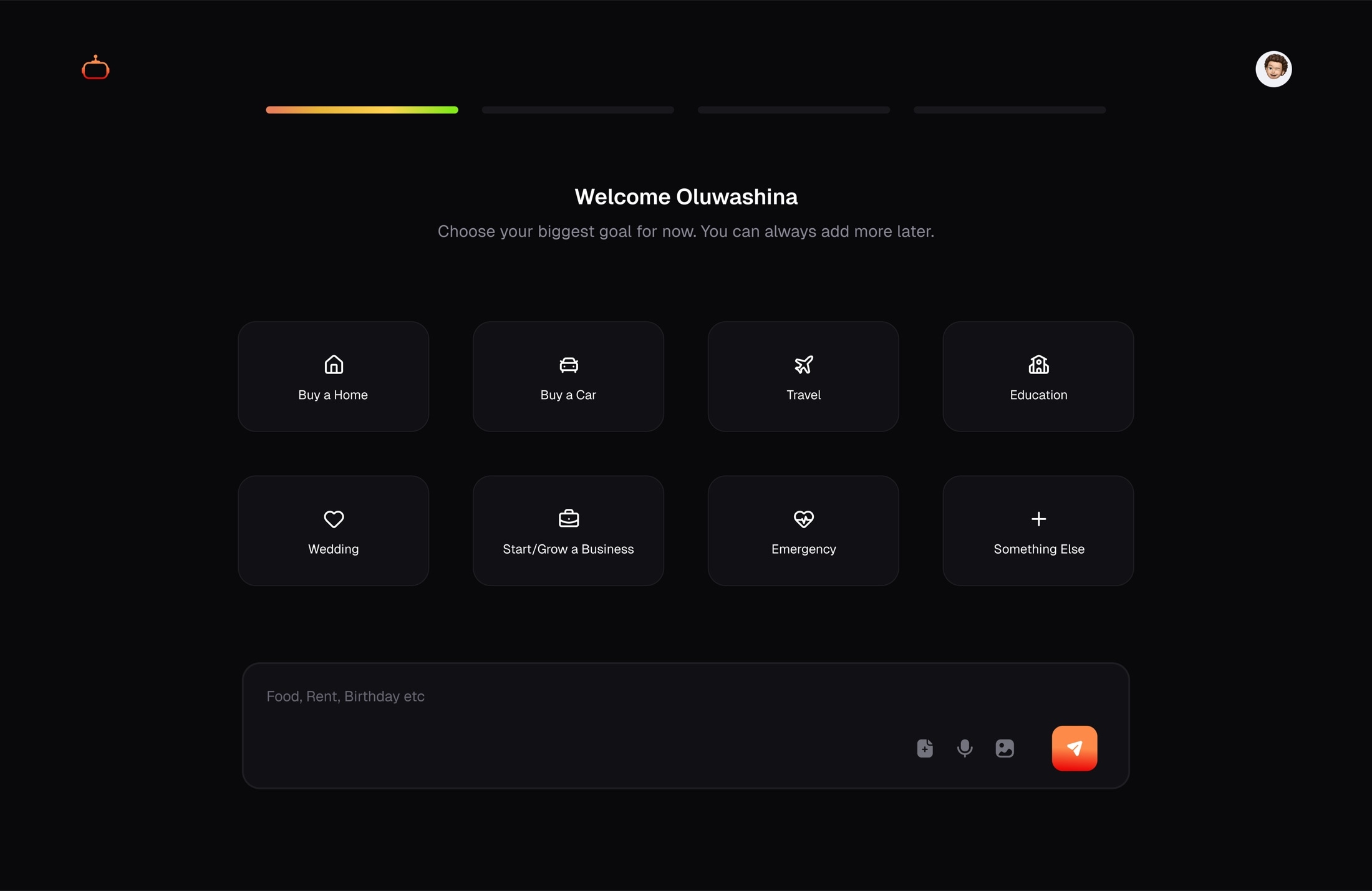
Goal categories — removing the blank-page problem before the model proposes a plan.
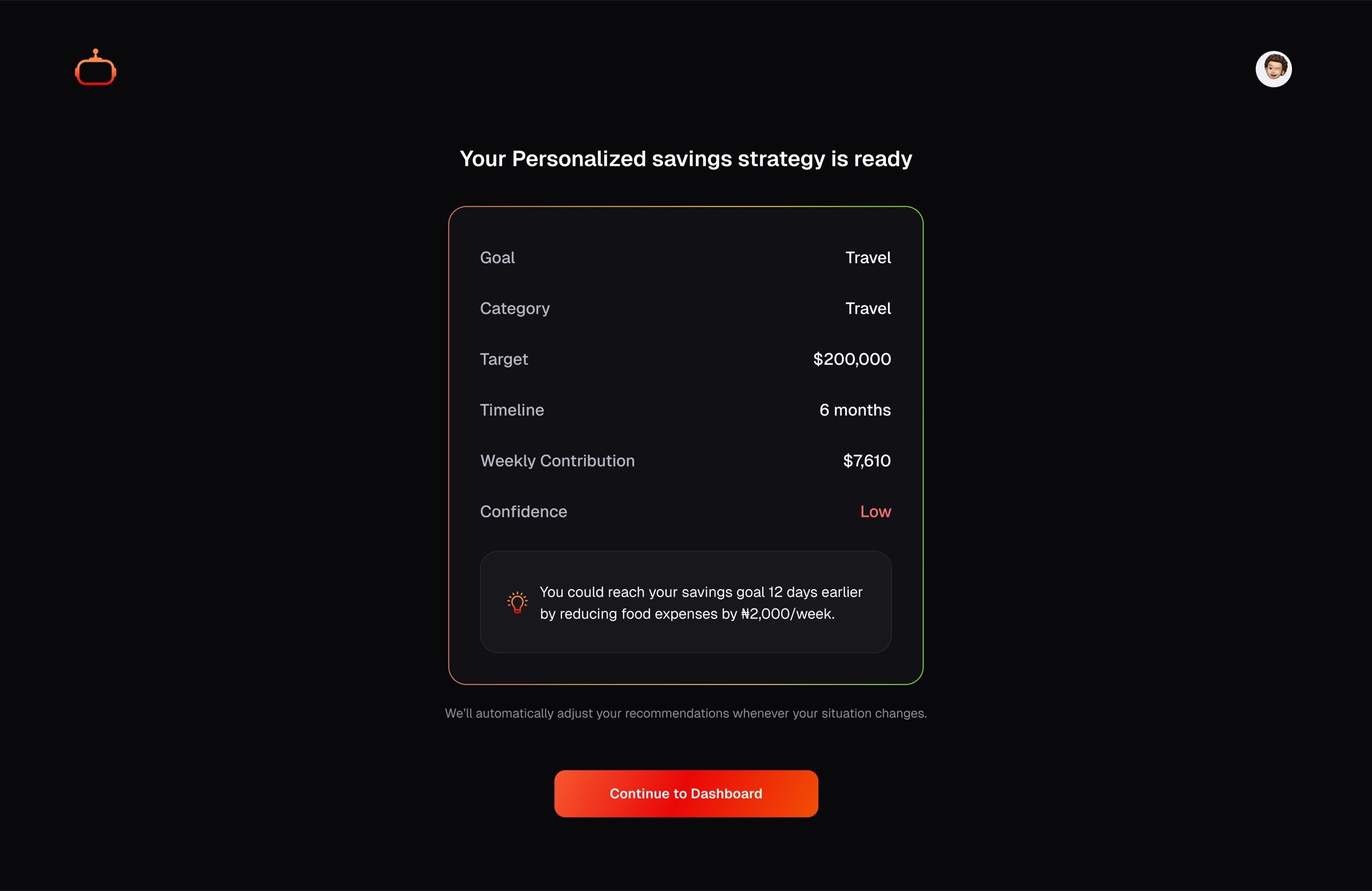
A live example: target, progress, and a computed monthly contribution shown before the user commits.
6.5 Goal progress — the “barcode” bar
Individual goals use a segmented, tick-marked progress bar (nicknamed “barcode” internally) instead of a single smooth fill. Each tick reads as a discrete unit of progress, which reads more like a savings thermometer than a generic loading bar, and the heat-gradient fill means a glance at color alone (violet start → green finish) tells the user roughly how far along a goal is, even before reading the percentage. Every goal row also exposes its lifecycle inline — Add Money, Edit, Pause, Delete — so managing a goal never requires leaving the list.
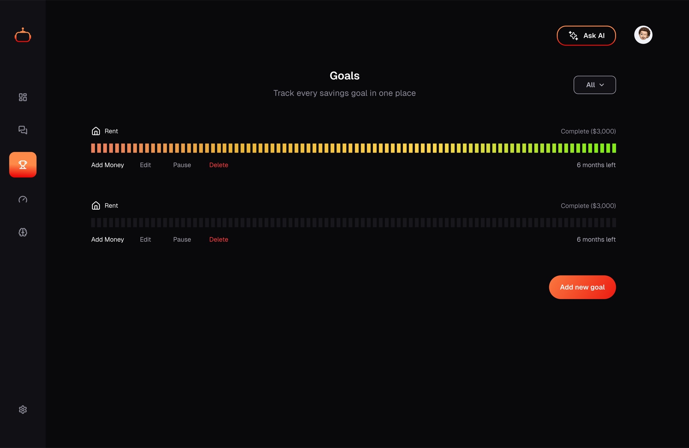
Goal rows: segmented progress fill, inline lifecycle actions, and a plain-language time estimate.
6.6 Lori’s Insight
A single persistent card, always bordered in the living gradient treatment, holds one surfaced insight at a time (“You’ve consistently saved more on Fridays”). It was deliberately reduced in scope during development — an earlier “Apply Recommendations” action button was removed, and the card was renamed from the generic “AI Insight” to the branded “Lori’s Insight,” collapsing what had been a system feature into a first-person statement from the product’s persona.
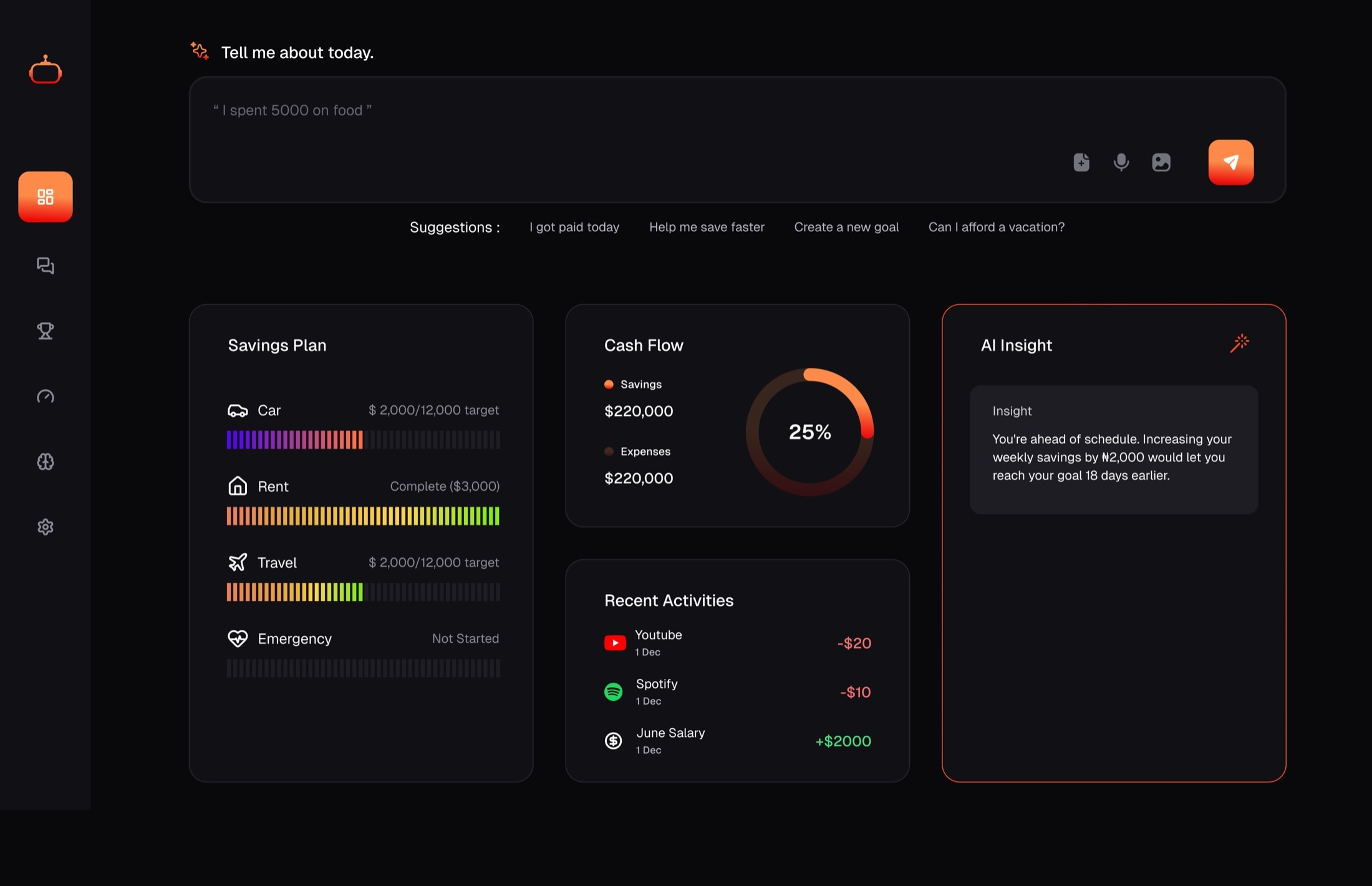
Lori's Insight — one observation, always attributed to Lori by name, not to an anonymous “system.”
6.7 Feature grid
The landing page’s capability summary intentionally uses the product’s own voice for every heading (“Chat, don’t type forms,” “Goals that track themselves,” “Real analytics, not vibes”) rather than neutral feature-list phrasing — each headline is also an implicit contrast with a competitor pattern the reader is assumed to already be tired of (manual categorization, goals that don’t update themselves, dashboards that round numbers). Six capabilities, each framed as a rejection of a familiar budgeting-app annoyance.
6.8 Authentication
Login and signup are the only screens in the product that aren’t dark-on-dark cards floating over other content — they’re a single centered card on a plain black field, with no sidebar, no navigation, nothing competing for attention. Google OAuth is offered as a secondary path beneath a visual divider, and the login screen specifically surfaces OAuth and email-confirmation errors inline (a fix made after the fact, once real users hit silent failures) rather than failing silently. Login is deliberately the quietest screen in the product; signup shares identical chrome, differing only in the fields and the call to action, so switching between them costs no re-orientation.
Key design decisions
| Decision | Rationale | Trade-off accepted |
|---|---|---|
| Dark-mode-only, no light theme | The core content is numeric (money) and needs to feel calm and premium; a light theme was never part of the reference design and would fragment the token system for no user-requested benefit. | No accommodation for users who strictly prefer light UI. |
| Chat as the primary input, not a supplementary assistant | Manual categorization is the actual point of failure in budgeting apps; conversational input matches how people already narrate their spending to themselves. | Requires reliable NLP parsing of amounts/currency/category; ambiguous input needs graceful fallback. |
| Distinct gradient for onboarding vs. brand accent | Onboarding is a “warming up” state, not an AI-speaking moment; reusing the brand gradient would blur that distinction. | Two gradients to keep visually consistent instead of one. |
| Segmented “barcode” bar over a smooth progress bar for goals | Discrete ticks read as accumulated effort (each contribution is a visible unit) rather than an abstract fill percentage. | Slightly busier visual than a plain bar; needs a shared gradient-stop utility to stay consistent across bar styles. |
| Currency as a first-class, user-set preference | Target users transact primarily in NGN but the product needs to serve USD/EUR/CAD/GHS/KES/ZAR users without a rebuild; hardcoding “$” would misrepresent real amounts. | Every AI-generated string, onboarding bracket, and goal target had to be retrofitted for currency-awareness rather than assumed correct from day one. |
| Landing page reuses real product components as marketing mockups | Screenshots go stale the moment the UI changes; recreating the actual dashboard/chat/goals markup in the marketing bundle keeps the pitch honest and low-maintenance. | Marketing bundle ships product-shaped components frontend-only, simulated rather than live-wired to data. |
| Motion reserved for AI-attributed surfaces only | If everything glows, nothing signals “intelligence is present here”; restraint makes the two animated surfaces (Insight card, Ask AI button) legible as a deliberate signal. | Other cards that might benefit from a liveliness cue stay static by design. |
| Self-hosted Geist font instead of a CDN font load | Removes a third-party network dependency and guarantees numeral rendering matches the design source exactly. | Slightly larger initial bundle vs. relying on browser font caching from a shared CDN. |
Accessibility
- A global
prefers-reduced-motionrule collapses every animation/transition to near-zero duration, layered under component-level reduced-motion overrides already present on the AI-glow and shimmer effects — belt-and-braces so no future animated component can slip through unguarded. - Color is never the only signal: positive/negative deltas pair a color with a directional indicator and explicit text (“13.3%,” “Vs last month”), and goal status uses text labels (“Complete,” “6 months left”) alongside the gradient fill.
- Interactive text fields share one focus treatment — a gradient ring that fades in on
:focus-within, applied consistently to the chat composer and every input/textarea in the app — so keyboard focus is always visible and never sacrificed to the dark theme’s low-contrast borders. - Dark-mode-only reduces the risk of light-on-dark contrast regressions common in apps that maintain two themes, at the cost (noted above) of offering no light alternative.
Responsive behavior
| Breakpoint | Behavior |
|---|---|
| Desktop (lg) | Full three-column card grid; sidebar rendered as a persistent vertical rail. |
| Tablet (md) | Two-column grid — Savings Plan and Cash Flow/Activities share a row; the AI Insight card spans full width; sidebar remains vertical. |
| Mobile (< md) | Single-column stack; the sidebar collapses into a top bar with a slide-in drawer rather than a persistent rail, to reclaim width for content. |
Challenges & trade-offs
Retrofitting currency after building in USD-first
Onboarding income brackets, AI-generated recommendation copy, and goal targets were all originally hardcoded to a “$”-prefixed USD assumption, then converted to read the user’s actual currency preference in a dedicated pass. The lesson carried forward: for a product whose primary market transacts in Naira, currency should have been a constructor argument from the first screen, not a retrofit — the fix touched five separate surfaces that could have been written currency-aware the first time.
Keeping the AI-presence motion language legible
Early experiments risked the gradient shimmer/glow effect creeping onto more surfaces than intended (buttons, cards, badges), which would have diluted its meaning. The resolution was procedural rather than purely visual: define exactly two reusable classes (ai-glow-border, ai-glow-border-sm) and restrict their use to the two surfaces where “Lori is speaking” is literally true, rather than letting the effect become a general-purpose “make this pop” utility.
Onboarding needed a second design pass once real content existed
The first working version of the adaptive onboarding flow was functionally complete but visually rough against updated mockups — border radius, alignment, and the shape of the “synthesis” pill were all revisited only once actual AI-generated plan text was flowing through the screens. This is a recurring and expected pattern: a flow’s real visual problems (text overflow, awkward line breaks, pill shapes that only look right with placeholder copy) only surface once it’s carrying real content, not lorem ipsum.
What's next
- Wire the marketing landing page’s simulated interactions to the same data layer as the authenticated product, so the pitch and the product never drift apart.
- Extend the reduced-motion and focus-ring accessibility work with a full contrast audit now that Analytics and Insights surfaces are live.
- Voice input (already stubbed as a composer affordance) as a second natural-language entry point, extending the “chat, don’t type forms” principle beyond typing.
- Light theme remains explicitly out of scope until there’s user evidence it’s needed — the system is intentionally not designed to support one yet.
Appendix — design tokens reference
| Token | Value |
|---|---|
| --background | #0A0A0C — page canvas |
| --surface | #111114 — default card fill |
| --surface-elevated | #17171B — raised panels |
| --border-subtle | rgba(255,255,255,0.08) |
| --border-strong | rgba(255,255,255,0.14) |
| --accent-from / via / to | #FD8A48 / #EA0707 / #F67606 — brand / AI-presence gradient |
| --accent-solid | #FB7D3F — flat accent for icons and small marks |
| --positive / --negative | #4ADE80 / #FB7185 |
| --progress-from / via / to | #FD8A48 / #FFD34F / #84EA18 — onboarding-only gradient |
| Typeface | Geist Sans (UI) / Geist Mono (numerals), self-hosted |
| Motion | ai-border-shimmer 7s linear infinite; ai-glow-pulse 3.6s ease-in-out infinite; both disabled under prefers-reduced-motion |